Hamnet’s cinematography shot by Łukasz Żal, PSC is the kind of work that invites technical scrutiny precisely because it never feels like “tech for tech’s sake.” Across interviews and cinematography-community conversations, Żal frames the image-making around point of view, tone separation, and an approach that accommodates magical realism without breaking the physical credibility of the world. That intent is visible on the screen as a coherent system: camera format choices that preserve texture, lighting that reads motivated yet shaped, and a color strategy that supports emotional contrasts rather than decorative stylization.
Sources: ASC “Clubhouse Conversations” with Żal (ASC); discussion of POV/magical realism (AwardsWatch).
Camera format and image foundation
One concrete, verifiable technical anchor that has been publicly stated is that Hamnet was shot primarily on the ARRI Alexa 35. That choice matters in practical, “set-to-DI” terms: it supports a modern digital negative with robust latitude and color response, which is especially useful for a film leaning into naturalistic lighting and controlled highlights in window-lit interiors.
Source: American Cinematographer social post noting “shot primarily on the ARRI Alexa 35” (American Cinematographer / Facebook).
Visual point of view as an on-set principle
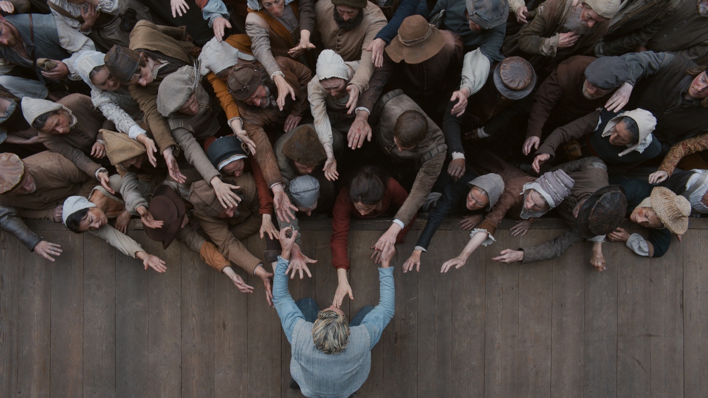
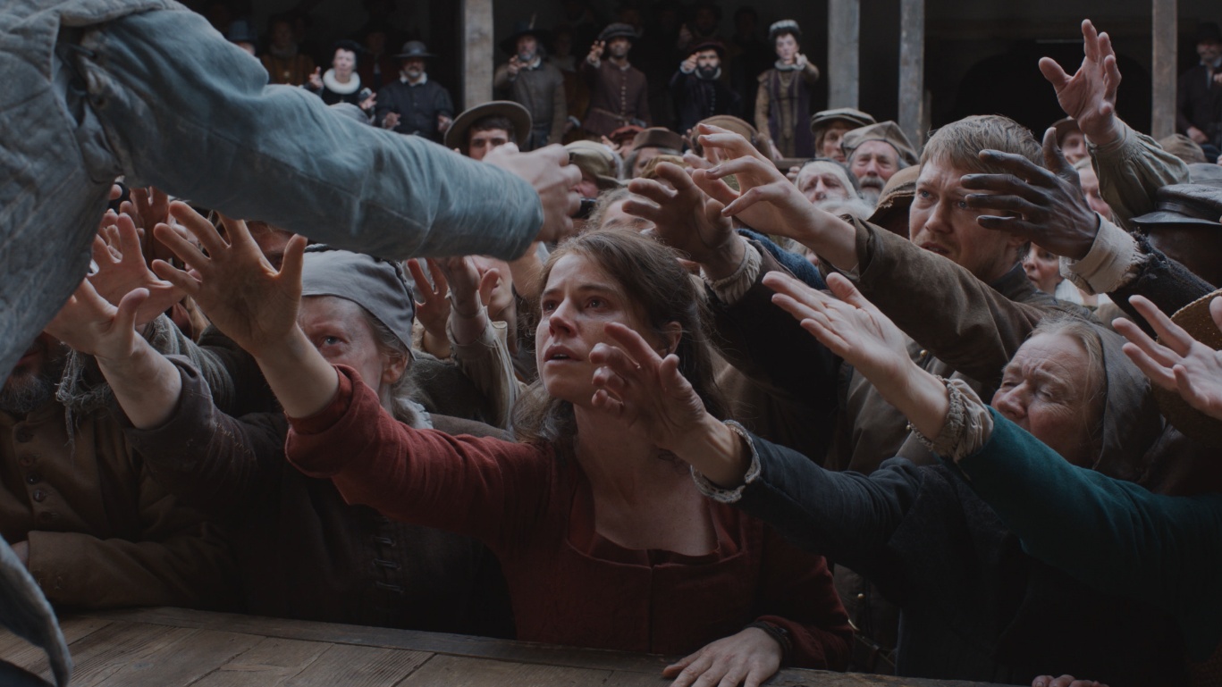
A key “magazine-grade” takeaway from Żal’s own comments is how deliberately the film treats POV as design, not just coverage. In interview, he speaks about creating “death’s point of view” and balancing that with the film’s magical realism—language that translates, on set, into repeatable choices about where the camera lives, when it observes, and how it transitions between the domestic and the uncanny. This pushes the cinematography away from neutral classicism and toward authored perspective, while still keeping the image grounded.
Source: (AwardsWatch).
Lighting: motivated sources, shaped darkness
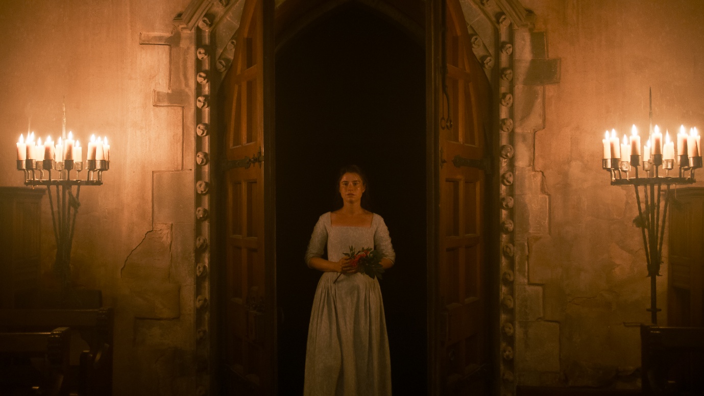
Żal also discusses individual lighting scenarios in a way that reveals process, not just intention. In Filmmaker Magazine, he’s asked about a striking attic composition small figures low in frame, a candle source, deep surrounding black and the conversation centers on how such images are arrived at through planning and benchmarks. That’s very “set practical”: it implies a workflow where you establish reference frames (a “benchmark image”) and then keep the film’s lighting vocabulary consistent, scene to scene. It’s an approach that aligns with period work that wants to feel tactile and lived-in: practicals (like flame) become motivation, while the crew’s shaping keeps the frame readable and emotionally focused.
Source: (Filmmaker Magazine).
Color separation as storytelling
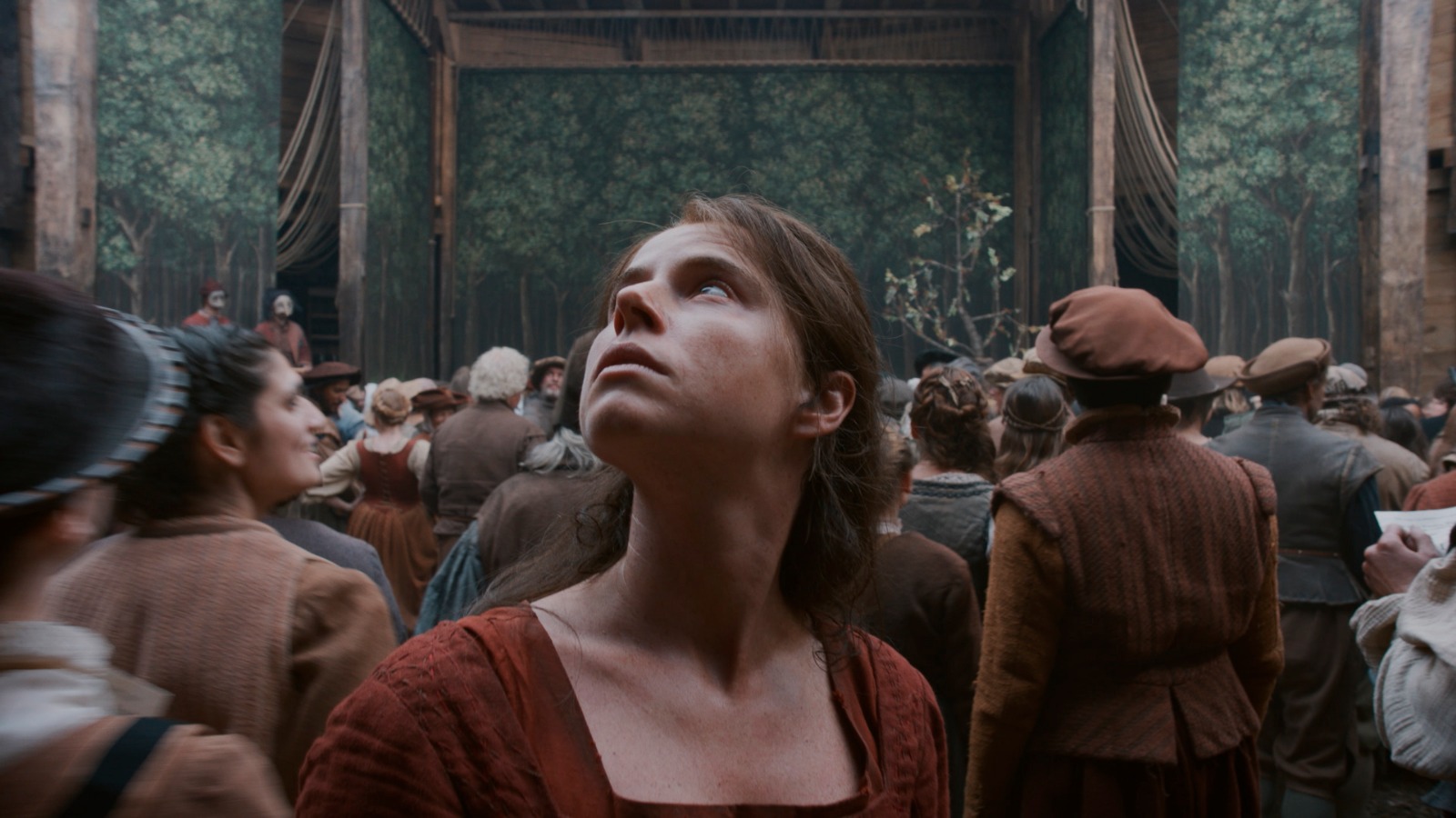
A particularly useful, explicitly sourced detail is Żal’s discussion of color contrast between characters/locations,for example, distinguishing Will’s spaces with cooler tones (blues/grays) versus Agnes’ world with warmer/earthier notes. This is not merely production design; it’s cinematography-plus-grade working as a narrative map. In a magazine context, that reads as a deliberate palette architecture: using wardrobe/environment and photographic rendering (exposure, white balance bias, filtration choices without us claiming specifics) to make emotional geography legible.
Source: (AwardsWatch).
Movement and framing: “presence” calibrated for performance
The ASC conversation format is valuable because it’s rooted in cinematography craft talk rather than purely awards-season messaging. Even without a publicly indexed, line-by-line technical breakdown in that page, the fact that ASC spotlights the work in an extended discussion underscores that the film’s camera strategy is intentional and discussable at a professional level consistent with what you see: movement that tends toward responsive presence (a camera that feels like it listens), and framing that privileges performance and physical detail over period spectacle.
Source: (ASC).